Words are a medium of expression for us humans. Something that when expressed correctly, can bring a huge impact to one’s life. Similar can be said about case design. An element that when done right, becomes the watch’s identity, and when done great, becomes an icon. However, looking good and having identity are two completely different things as it takes great design for a watch to have an identity attached to itself. Out of the many great designs available, I find that Seiko’s Grammar of Design is one that’s too often overlooked and underappreciated.
Call me a fanboy, I can’t deny, I’ve happily fallen into this rabbit hole, and might not be getting out anytime soon. Just like how the designs from Lexus look very Japanese, Grand Seiko to me, happens to be one of those brands that scream Japanese the moment you look at the way they’re designed.
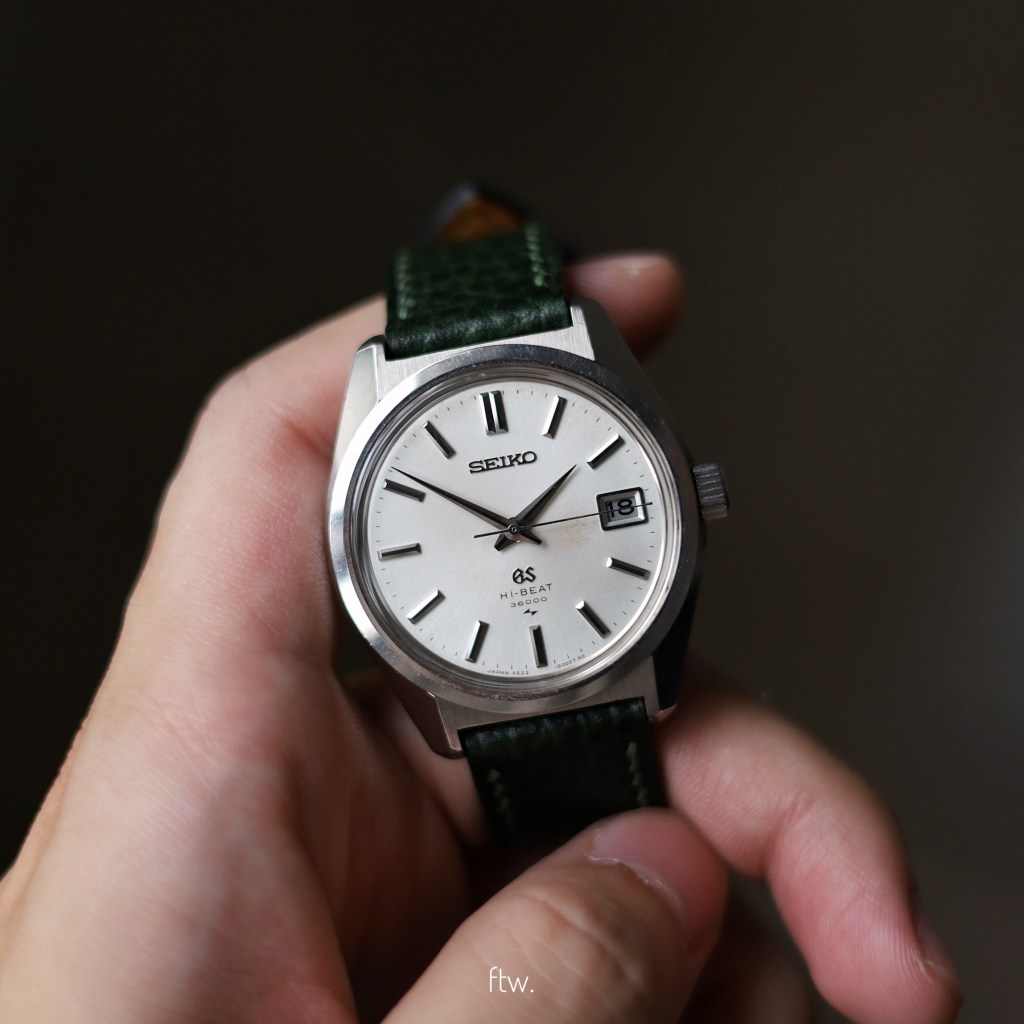
When I first discovered Grand Seiko, it was the sparkle effect from the case, indices and hands that swept me off my feet. Through that experience, I soon learnt about a language that I fell in love with, the “Grammar of Design” by Taro Tanaka. A design language consisting of 9 elements based on essentially 3 core principles (as mentioned on the Grand Seiko site). All of which, seem to be crafted to interact with one natural element, light. Yes, the design allows a watch to catch the slightest glimpse of light to highlight what the wearer needs to see. If you’ve ever tried on a Grand Seiko under relatively poor lighting conditions, you’ll know what I mean. If you haven’t, you should!
Now let’s talk principles, starting with my favorite element, flat surfaces. In the Grammar of Design, emphasis is put on the flat surfaces present on the hands, case, and dial where the surface should be as wide as possible for better legibility. Next, the inclusion of flat surfaces with two-dimensional curves. Instead of being three-dimensional, having the curves that are two-dimensional allows a case with sharp lines to look very put-together when paired with the large flat surfaces mentioned previously. Lastly, the cherry on top is the distortion-free surface that is achieved through a technique known as Zaratsu polishing. However, principles are worth nothing if there’s no element that communicates these great principles to our eyes, right? With that said, the nine elements of the Grammar of design (according to Grand Seiko’s website) are:
- The double width index at 12 o’clock.
- Rectangular indexes that are multi-faceted.
- The presence of a semi-recessed crown.
- A mirror-polished bezel.
- Mirror-polished surfaces of the case.
- A flat dial.
- Multi-faceted hands.
- The case has a curved side profile.
- The inward-slanted bezel and the case side.
I know, these might sound very theoretical and one might doubt if these elements really make a difference. Well, credit should be given where credit is due. After owning my first Grand Seiko, the 45GS, knowing the fact that something from 1968 still puts a smile on my face through how it interacts with light, really speaks for itself.
With it all said, the Grammar of Design is proof that pretty watches don’t always have to be those that you can only bring out once in a blue moon. The fact that something can look this gorgeous while taking practicality as a design consideration is really amazing. At least to me, that’s why Grand Seiko has a unique place in my heart. As of now, it’s hard to picture an ideal watch collection without having a Grand Seiko in it.
